Sfusato
A limoncello named for the Sfusato Amalfitano — the long-nosed Amalfi lemon. Packaging that should smell of the south before the cap ever comes off.

A limoncello named for the Sfusato Amalfitano — the long-nosed Amalfi lemon. Packaging that should smell of the south before the cap ever comes off.
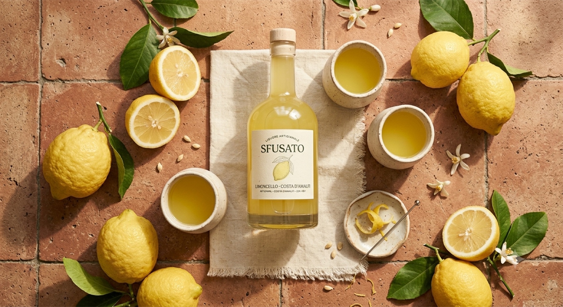
The shelf is a wall of yellow. Every limoncello shouts lemon in the same cartoon way. Sfusato had to feel like the real thing — a hand-picked, knobbly, fragrant Amalfi lemon — not the candy version.
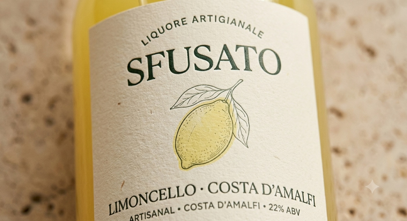
So the whole identity is one honest drawing of the actual Sfusato lemon — elongated, with its little nose — set in a calm botanical frame. No gradients, no sunshine clip-art. Just craft, restraint, and a name that tells you it's the genuine cultivar.
Not the obvious lemon yellow. A softer zest, the deep green of the leaf, the white pith, and a warm paper for the label stock. It reads premium because it refuses to scream.
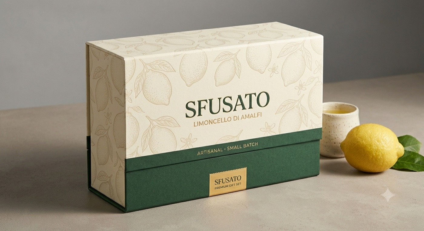
A centred apothecary label — the kind you'd trust on a bottle made by one family. Fraunces does the talking, with the lemon as the crest. The same drawing crops into a repeating pattern for the box and the tissue.